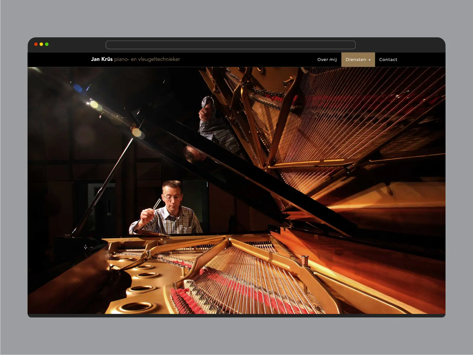
Jan Krüs, Concert Piano Technician
Back in 2008 we developed the visual identity for Jan Krüs, a Steinway certified piano technician active in the Arnhem and Nijmegen area in the Netherlands.
Background
Jan approached us the redevelop his brand identity. Within his service area is a well renowned technician and tuner. Doing the tuning op de concert pianos of music venues in the area, such as Musis Sacrum in Arnhem. He had a need for a basic set of identity elements, such as a logo, business card, letter head, envelope, invoice paper and livery for a van.
Jan’s approach for tuning is based on hearing more than using devices, because it results in a more natural and lively sound.
Strategy
The intention was to create a design that emphasizes the craftsmanship of Jan, as well as have a natural correlation to the world of (piano) music. And also to stress his concert quality work to all his (potential) clients.
The visual style of the brand identity for a piano technician were taken from the visual style of a grand piano itself Jan Krüs working on a grand piano
Design
We chose to work with the visual language seen on pianos. So dark colors. Black and white, but also gold and red. However we didn’t want to get too close to the visual style of Steinway or other pianomakers. We were designing an identity for a piano technician. Not a manufacturer. We combined the shape of a grand piano and an ear. Where in the place of the ear canal a tuning fork is placed.
The design is intentionally as clear as possible, without distracting ornaments. We emphasize the work of Jan: making pianos sound clear and beautiful.
Result
The result is a clear and recognizable identity for a piano technician, which is still in use and which still looks modern and up to date, after all those years. So an investment well made. Lasting for a long time. Just like a good piano.


